White Night review (Xbox One)
White Night was developed by OSome Studios and published by Activision on Xbox One. It was released on March 6, 2015 for $14.99. A copy was provided by Activision for review purposes.
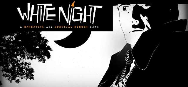
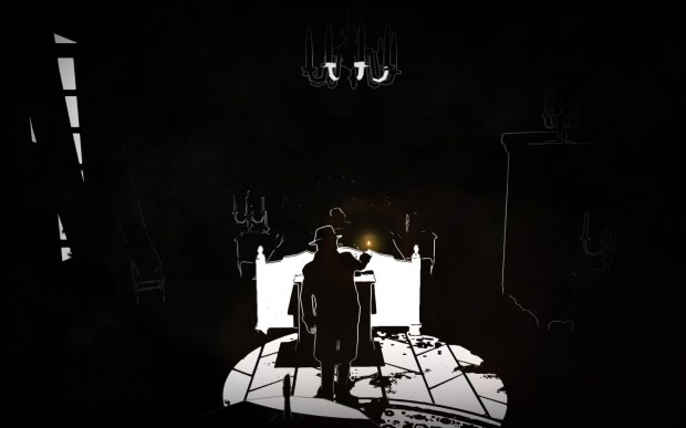
It’s so hard to dislike a game as beautiful as White Night. The stark, completely black and white visuals not only look gorgeous but are far more than just a gimmick, actually adding to the dread and atmosphere of this haunted house game. But, unfortunately, White Night just not very fun.
After making it through the first two chapters, I had finally had enough of the frustration and was pretty much ready to throw in the towel. I pushed through begrudgingly, but there are only so many random, pointless ghost deaths a man can handle before losing interest in what started out as such a cool game.
Here’s what I liked:
The visuals — As I’ve already stated, the game makes use of a beautiful and striking completely black and white artwork style. The film-noir-meets-horror-story aesthetic is a perfect fit for White Night, as the darkness of the blacks mixes with the shadows, while the light represented by the whites provides you with temporary safety.
Here’s what I didn’t like:
Infuriating ghosts — There are ghosts all around White Night‘s haunted house. Some of them you trigger by entering areas without the right item or by rushing into a room without thinking, and the deaths that come as a result of these player mistakes always feel fair. But most of the ghosts represent inescapable deaths waiting to happen just because you walked through a completely random, unseen hot spot. It’s absolutely maddening. Also, what start as really cool, genuinely scary ghost encounters lead to ghosts essentially kind of “beating you up,” which looks incredibly silly.
Save points — You must sit in one of the few armchairs throughout the house to save your game. If you die (from one of the aforementioned annoying ghosts) and you haven’t recently taken the time to backtrack to a chair to save, you need to re-do everything you just did. It’s absolutely maddening.
The camera — It’s sort of like the camera in the original Resident Evil games where it changes between different stationary angles as you move through the rooms, but with much more poorly planned transitions. Many, many times I’d be walking up through a door only to then be coming from the top of the screen down into the next room or from the corner of the screen, diagonally into the room. It’s completely disorienting and given the dark nature of the design, adds to you being completely lost at pretty much all times.
A story told through notes — This gaming trend needs to die. Instead of narrative events actually happening, you pick up notebooks and photos left in all the rooms and actually have to read them if you want to know all the details of the story. If I really want to read, I’ve got plenty of books waiting to be read on my shelf that I’m ignoring while I play a video game.
Wrap-up
I very much wanted to enjoy White Night. It has elements of classic graphic adventures that I love, and the art style is great. But playing Osome Studio’s title is an exercise in frustration. Perhaps a way to fight back against the ghosts would have improved the experience. A better camera system, maybe? At the very least a better saving method so you don’t have to keep repeating the same scenes over and over again when killed by a ghost you completely knew was there, but ran into anyway would have been welcome. Hopefully a better game comes along one day with this kind of style.
Score: Skip It


