Duels of the Planeswalkers 2012 review (XBLA)
 The original Duels of the Planeswalkers was perhaps the best bad game one could play on XBLA. It launched with numerous bugs, many of which remain unfixed today. A small number of cards didn’t work as described in their text, it was inordinately difficult to arrange blocking if there were too many attackers, and certain design decisions crippled the strategic calculus normally found in a Magic game. And in many ways the first Duels game played like a giant teaser advertisement for the rest of the Magic universe, rather than as a game whole and complete unto itself. It was still hugely fun to play, because Magic is a fun game with great art and clever mechanics, but the game lacked a certain richness, that attention to detail and the player experience that marks a great game.
Thank Wizards and Stainless, then, for making the bold decision to leave behind the old game, warts and all, and concentrate on creating the game that the first Duels could have been. The new Duels of the Planeswalkers 2012 addresses many of the complaints about the first Duels, providing a smoother, faster game experience, a cleaner UI, vastly improved deck editing, a variety of online cooperative play formats, and a generally richer, better game experience.
Here’s what we liked:
Real Magic Mechanics – The Duels play environment is based around pre-constructed decks assigned to different Planeswalkers, characters of tremendous power in the Magic universe and prime movers of much of the drama at work in the Magic mythology. What this means is that players do not build decks from the ground up, but rather edit and rearrange cards that have already been put together according to a play style or theme. This actually works exceptionally well for a casual Magic environment, and offers a fantastic way for new players to get used to the game, as well as providing a way for experienced players to not break the bank trying to produce a competitive deck.
The first game did not do deck editing well. Indeed, one would be hard-pressed to even call it “editing.” In both Duels games, players choose from a variety of core decks comprised of 60 cards (the minimum number of cards required of a Magic deck in standard format) and then unlock additional cards. In the first game, those cards could be added to the core 60 card deck in order to “enhance it,” and the game would auto-add land in order to keep land in the deck around 40%, but players could not remove any of the core deck cards. This meant that players were faced with a rather unfortunate decision: ignore most of the unlocked cards, or have a deck of 90+ cards that thus made the chance of drawing any particular unlocked card rather unlikely.
The new game does deck editing as it should be done, allowing players to swap core deck cards out for unlocked cards and produce whatever configuration they desire. As DLC adds new cards, the possibilities for different variations on each deck become more robust, meaning that the game should get better with age.
Online Coop – Oddly enough, the first game did not have online coop. If you wanted to play a 2v2 game with a friend as your teammate, you needed to have them over, sit them on a bean bag chair and hand them a controller. Or, you needed to enter a 1v1v1v1 free-for-all room and team up on unsuspecting players, a practice that was understandable given the lack of options, but utterly annoying. Here, again, the new Duels delivers. Playing 2v2 matches with a friend or with a stranger is as easy a quick menu selection, and the format really shines.
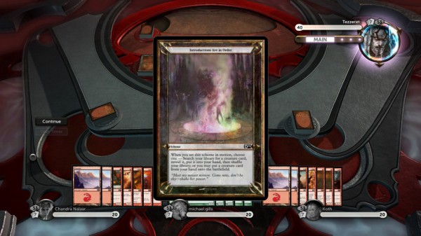
In addition, the new game offers the Archenemy format, a game type in which three human players cooperate to take down a super-powered archenemy Planeswalker. The archenemy has bigger health, can do more things, and has a second deck of “scheme” cards that they play alongside their core deck. These schemes are devastating, and players will find that they really need to work together if they want to enjoy regular success. Even then, it’s far from guaranteed.
 Balance – Balancing a CCG is always a difficult task, but here nine of the ten decks balance very well against each other, giving Duels 2012 a rich meta-game and a lot of options. Whereas the first Duels had very clear “best decks,” the new game enjoys much more card variety and much more attention to balance issues, and that means that players can choose strategies and play styles without sacrificing a realistic chance of winning.
Ambiance – The first Duels game had visuals that alluded to the five colors of mana that power the Magic: the Gathering universe. Menus would appear atop some “place” with maybe an angel statue and white columns to signify white mana. The new game, by contrast, overlays the rotating menu selection atop an impressive background scene that pans through forests and swamps and plains and islands and mountains, and mimics the very same art style Magic players will see on land cards if they went out and picked up a starter deck today. The sense that the game is taking place in some “place,” and that the “place” belongs to the Magic universe, rather than merely alluding to it, is palpable.
Music – The soundscape is far more sparse in the sequel than it is in the original, and thank goodness. Gone are the guitar staccatos that were supposed to convince us nerds that “Magic is hardcore, bitches.” Instead, more somber, electronic instrumentation provides the aural backdrop to the game, and fits well with the contemplative and strategic nature of Magic.
Here’s what we didn’t like:
Utopian view of player psychology – Stainless Games seems to have some difficulty with the idea of “griefing,” the activities of players who derive enjoyment from just screwing over other players. Players have all sorts of selfish motivations – unlocking cards, gaining rank, etc – and for some, griefing is a common enough practice that game designers should make efforts to design around it. This game does not. On the one hand, this speaks well of Stainless. The dev team over there must be super polite and British-y. On the other hand, it means a bit of annoyance for regular players.
A few examples should suffice to show the problem and the solution (hint to Stainless, fix this). When loading up the 2-headed giant game type, the game can’t begin until each player selects their hand. Some players are sitting there and doing nothing, waiting for the game host to quit the game in frustration and then give the griefer the win. Unfortunately, there is no way to leave the game in frustration if you’re not the host, so you have to either exit back to the dashboard or wait until the host gets pissed enough to end the game.
In addition, players can still annoy the crap out of other players by repeatedly pausing the game with the X button. It would be nice if the ability to do so was in part contextual, such that the player actually had to have some action they could take in order to repeatedly pause the game.
Perspective on the board – The only UI decision that may have made things worse is that the board seems pretty far away from the perspective of the player. This game was reviewed using a 40” HD plasma, running at 1080p through an HDMI cord, and sitting roughly 8 feet from the screen, and yet cards were routinely difficult to see without using the zoom-a-card function. They just seem so much smaller than they need to be, and in the early game, the board just seems so much larger than necessary. While there are two perspectives (let’s call them “really tall, long-armed person in a chair” and “god’s eye” view), a third perspective that had a “shorter, normal armed person in a chair” perspective would be nice. Or, alternately, it would be be nice to have the chair perspective be contextual, so that early game (with few cards) would have a slight zoom-in, which would then zoom out as more cards were put into play and more of the playing table was being used.
Too few playing styles – One of the major things that is awesome about Magic is that there are so many ways to approach playing. You can build around big creatures (affectionately known as “fatties”) or build around a deck that has hordes of small critters (weenies) ready to overwhelm the opponent’s ability to block. You can force a player to discard useful cards (the “card advantage” strategy), figuring that if they have nothing in their hand to cast, then you have nothing to fear. You can destroy their land, so that they don’t have the resources to cast their spells. You can take away cards from their library and shovel them into their graveyard (“milling”) so that they never have a chance to use them, with the added benefit that a player who runs out of cards in their library automatically loses the next time they have to draw a card. You can use direct burn spells to do damage directly to your opponent, without worrying about attacking them with creatures of your own. You can use control magic to foil any successful strategy of your opponent.
So far, in Duels 2012, you can use creatures. Big creatures or little creatures. There are splashes of control and direct burn, and there are nice variations in how creatures work to deal their damage, but it would be nice to have more meta options.
Koth is a tool – We mentioned earlier that nine of the ten decks are well done. The 10th deck, called Strength of Stone and associated with the Planeswalker Koth, is terrible. It works just like the blue-green Ancient Depths deck and the mono-green Apex predator decks, in that it works best by getting out big, fat creatures and then devouring the blockers and securing the win. Unfortunately for Strength of Stone, the other two decks enjoy significant ability to “ramp” up their deployed lands at a faster pace than normal, thus making it easier to cast the big creatures. Not so much with Koth, who in most matches sits there and thinks to himself: “Man, if I had two more mana, this match would really be competitive. I think. Well, maybe.” Here’s hoping Wizards fixes this through a slight deck edit as soon as possible.
 All in all, the new Duels 2012 is awesome. The few things we didn’t like are all things that could be easily fixed by future DLC, or that players will become inured to rather quickly. Everywhere in this game, from the menus to the music, from the core mechanics to the splash screens, one can see that serious attention was paid to making this a great game experience. And if it doesn’t work 100%, it works plenty. Duels no longer plays like a teaser for the rest of Magic – it plays like an integral part of the Magic universe, with its own place in the game pantheon, different but as essential as the paper version or Magic: the Gathering Online.
The attention to detail in this game makes all the difference. Players who like card games, strategy games, or fantasy themes, who have enjoyed games like Puzzle Quest or Clash of Heroes, will find themselves spending huge swaths of time with Duels 2012.
Score: Buy it!

