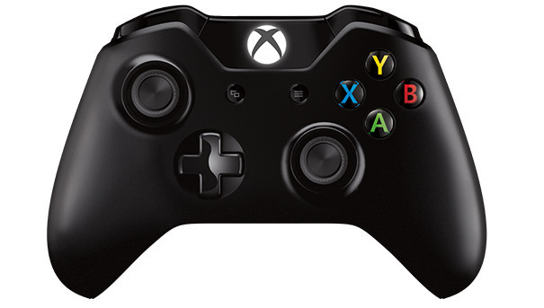
The new Xbox One Controller buttons
At a quick glance, the new Xbox One controller looks a lot like its predecessor, but look closer and you’ll notice some significant design changes. One such change is the removal of the start and back buttons, which have been replaced with the menu and view buttons, respectively. Microsoft told IGN that the menu button can be used for “bringing up in-game menus, showing video playback options, and accessing commands on the console’s user interface”. The view button, on the other hand, “will change views or provide more information in games and apps… includ[ing] viewing a map during a role playing game, displaying a leaderboard in a first person shooter, and enhancing the navigation of the console’s user interface.” The new buttons act similar to their current-gen counterparts, but were likely redesigned to resemble their in-game functions.
Source: IGN


